top of page
Fortnox
Team
Design team
Role
UX/UI-Designer
Responsibilities
UX-Research
Prototyping
User-centered design
Information architecture
Fortnox is a Swedish fintech company that delivers a cloud-based business platform for financial administration and related areas such as financing services for businesses.
Over the years, Fortnox has added new functions, services and applications, which has made the system even more complex, especially for new users.
Responsibilities
UX-Research
Prototyping
User-centered design
Information architecture
Role
UX/UI-Designer

Evaluate the existing navigation
In order for us in the design group to feel familiar and comfortable with the system to be investigated, we made a sitemap. The aim was to get a better overview of the existing navigation structure and also how the division of all the different categories looked like.
Research
In order to gain further insight into complex programs, a model analysis was also done on various web-based programs which had a lot of functions and information. This was done to further gain knowledge how to solve the information architecture in complex programs. Many of these programs were found to use a fat menu at the top of the program instead.
Workshop
A workshop was conducted and the purpose and goal with the workshop was primarily to bring in different alternative groupings within all categories and their terminologies, as well as to get clarity on which categories could belong to each other and which categories were more important than others.
The workshop was conducted with stakeholders from some of Fortnox's different departments. From the design group, we were four moderators where two of us observed and took notes, while the other two led the workshop. I was one of the moderators leading the workshop.
The workshop was done with a mixture of discussions and exercises. Where the exercises were done with an open card sort. Below are some of the discoveries that the workshop produced.
Sketching Lo-Fi
During the sketching phase, we sketched options for the left menu and options for the fat menu. Where the discovery from the research was implemented.
Sketching
_edited.jpg)
A/B testing the sketches with new users
Now we were more clear about the structure we were going to go with but not quite with which of the different layouts of the left versus fat menu we were going to make the prototype for. To determine this, an A/B test was carried out with new users. The two winning sketches from Love & Hate evaluation were refined with the changes that occurred as well as some of the good things from the other sketches.
After the A/B test was finished and after discussion with the stakeholders at Fortnox, it was decided that we would continue and make a more Hi-Fi prototype with a left menu structure.
Prototyping Hi-Fi
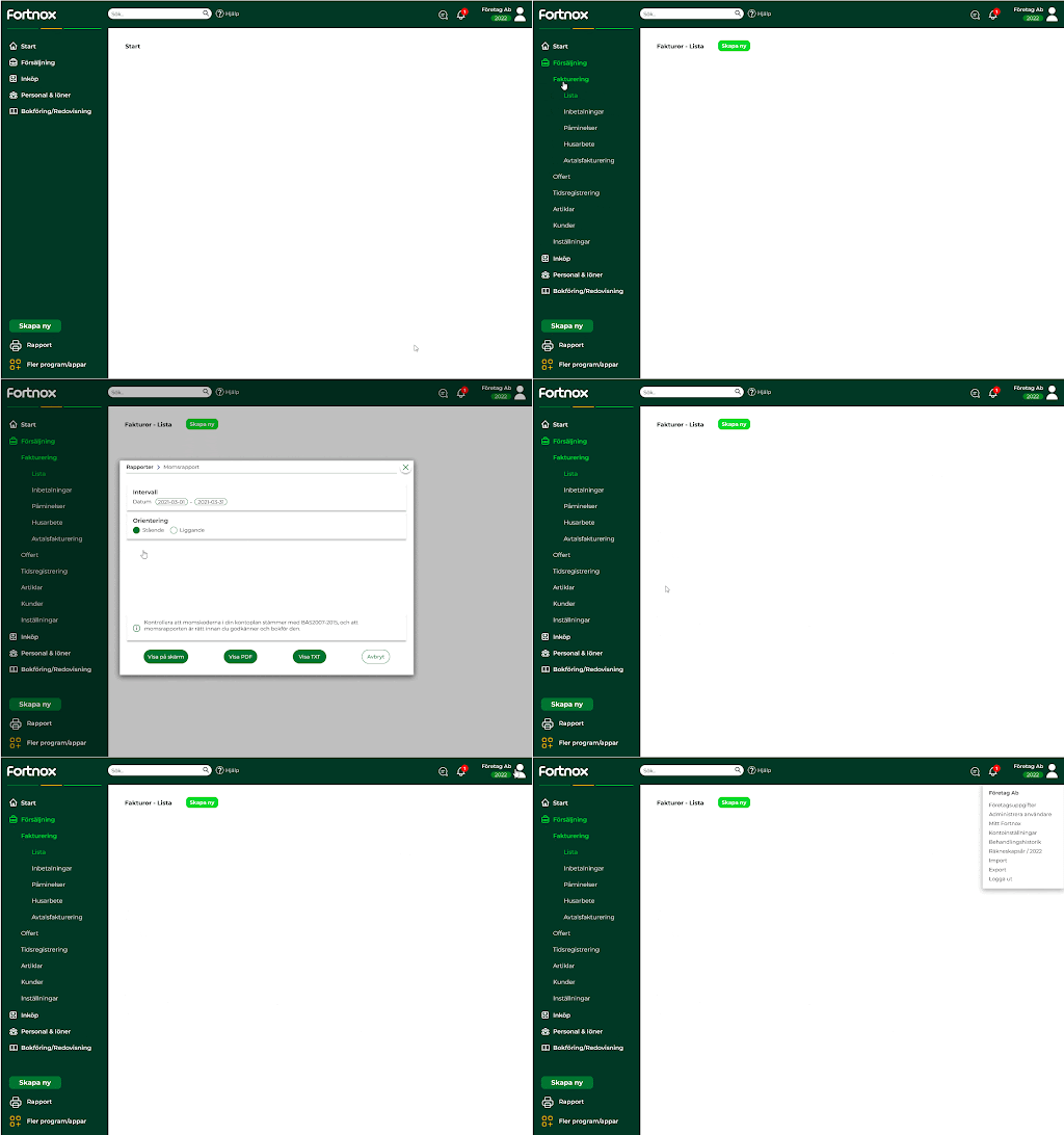
The prototype was created according to the requirements previously established and according to the results after the completed A/B test with new users. The prototype was made in Figma where Fortnox's graphic profile also was followed.
Prototype

Goal
The goal was to make a prototype for Fortnox that would make it easier for new users to navigate complex system and also examine challenges and problem areas new users might encounter.
Evaluate the sketches
To evaluate all the sketches we had, Love & Hate was carried out, which is a brainstorm-like method where we put up post-it notes on good and bad things, as well as whether any changes could be made. We carried out this method on all our current sketches, below you see an example from a sketch.
Good
Bad
Possible changes
Competitor analysis
A detailed competitor analysis was performed on various financial administration programs that were web-based. The focus was solely on the global navigation. Some of the standout discoveries that Fortnox's system didn't have but the competitiors did were:
Competitors used associated icons most of the time.
Icons
Left menu
Competitors had the global navigation as a left menu.
Min/exp menu
Menus could be minimized and expanded to show submenus.
Less scattered and more collected
Need hierarchy
The marketplace should be more clear

Avoid many clicks, don't be hidden in local menus


Results
At the end of the project, the prototype was evaluated using a usability test with new users. Which provided insights and results that were taken up with Fortnox and taken very positively to their work to change the navigation.
One of the major challenges we saw among new users in Fortnox's existing structure was with the terminology and categorization. We also saw the users having challenges with this in the new prototype, but not to the same extent. Overall, the new prototype provided more positive feedback from new users and the project provided useful information for Fortnox in their upcoming work on changing their navigation.
bottom of page